UI/UX Case Study — Redesigning Shopee App
Introduction
Shopee was first launched in 7 markets across Southeast Asia in 2015. Currently, it is the leading e-commerce platform in the region with a significant digital presence. Buying things online has become a common practice among millions of people around the world. To keep up with the trends driving online retail, Shopee has to stand out, focus its efforts on customers, and evolve side by side with the dynamic eCommerce industry. To provide a complete shopping experience curated specially for shoppers, it must be able to provide personalized shopping content, including exclusive rewards, deals, and vouchers that are suited to the customer’s shopping habits. Positive in-app user experience is also important because it keeps a user loyal to Shopee with fewer reasons to look somewhere else.
Research Objective
The purpose of conducting this UI/UX analysis is to develop empathy for the target users and enhance the user experience when they are using the Shopee mobile app. A positive user experience would keep users loyal to Shopee and this would enable Shopee to remain as the leading e-commerce platform across Southeast Asia.
Design Process
To develop empathy for the target users of Shopee, a proper Design Thinking process is required. While there are different approaches to the Design Thinking process, I streamlined the creative problem solving into the following 3 phases: Research, Define, and Design. The Research phase involves competitor analysis, academic work on eCommerce, usability inspection, and user-related research. The Define phase involves the creation of user personas, building user journey maps, identifying pain points, and defining design goals. Finally, the Design phase comprises ideation, wireframing, and building of high-fidelity prototypes.

Competitor Research
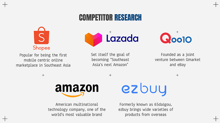
According to Statistica Research Department, Shopee was the most visited eCommerce website with around 10.88 million monthly web visits in Singapore as of the second quarter of 2020. This is followed by Lazada, a Singapore-based eCommerce provider, and Qoo10 with approximately 8.5 and 7.5 million visits, respectively. Amazon, the American multinational technology company, garnered 3.65 million online traffic, slightly higher than the 1.68 million monthly web visits of ezbuy.
Different eCommerce sites specialize in selling a different selection of products, including electronics, groceries, makeup, fashion, and home essentials. Other than the top 5 eCommerce sites mentioned, other popular sites include Carousell, Zalora, Forty-Two, and RedMart. With such a strong market competition, Shopee must strive to add value to customer satisfaction by improving the usability of its eCommerce site to gain a more competitive advantage over the other platforms.
Academic Research — Understanding Marketing Behaviors
Understanding different marketing behaviors and stages of the customer decision-making process are important. Consumers’ behavior can be classified into 4 key categories: awareness, preference, engagement, and advocacy.
The first phase of consumers’ behavior is awareness, and it happens when a particular product is new to the market. Brands need to seek interesting ways to market their products or services. Marketers must use attention-getting communication tactics to reach out to their target audiences.
Once consumers have gained awareness of the new product or service, generating preference compared to other competitors is crucial. Consumers’ behavior suggests that shoppers browse and buy on various channels and only a few people are loyal to only one channel. Nowadays, customers expect more personalized experiences. According to Accenture’s 2018 Pulse Check report, approximately 90% of the consumers are more likely to shop on platforms that recognize them and personalize the experience. Personalizing shoppers’ experience is now the key to driving business.
Consumers’ engagement influences marketing behavior because this is the crucial point at which users make a pre-purchase or purchase decision. This might involve researching more about the product or service to determine whether the information from previous stages has been accurate. This stage is important as it reflects the reality of consumers’ actual purchase experience. A positive purchase experience would encourage the users to remain loyal.
The final stage of consumers’ behavior is advocacy. This term is frequently referred to as word of mouth. Customers would typically share their purchase experiences with others. A positive purchase experience may positively impact the awareness and preference of others. Consumers’ marketing behavior occurs in a cyclical manner and it often impacts other consumers.
Academic Research — Understanding eCommerce Customers
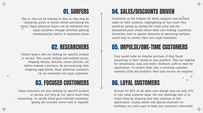
The greatest challenge for eCommerce platforms lies in understanding how to identify customers, attracting them, and converting them into returning loyal customers. The list comprises the 6 types of eCommerce customers and the tips to satisfy and convert them into loyal customers.
Heuristic Evaluation
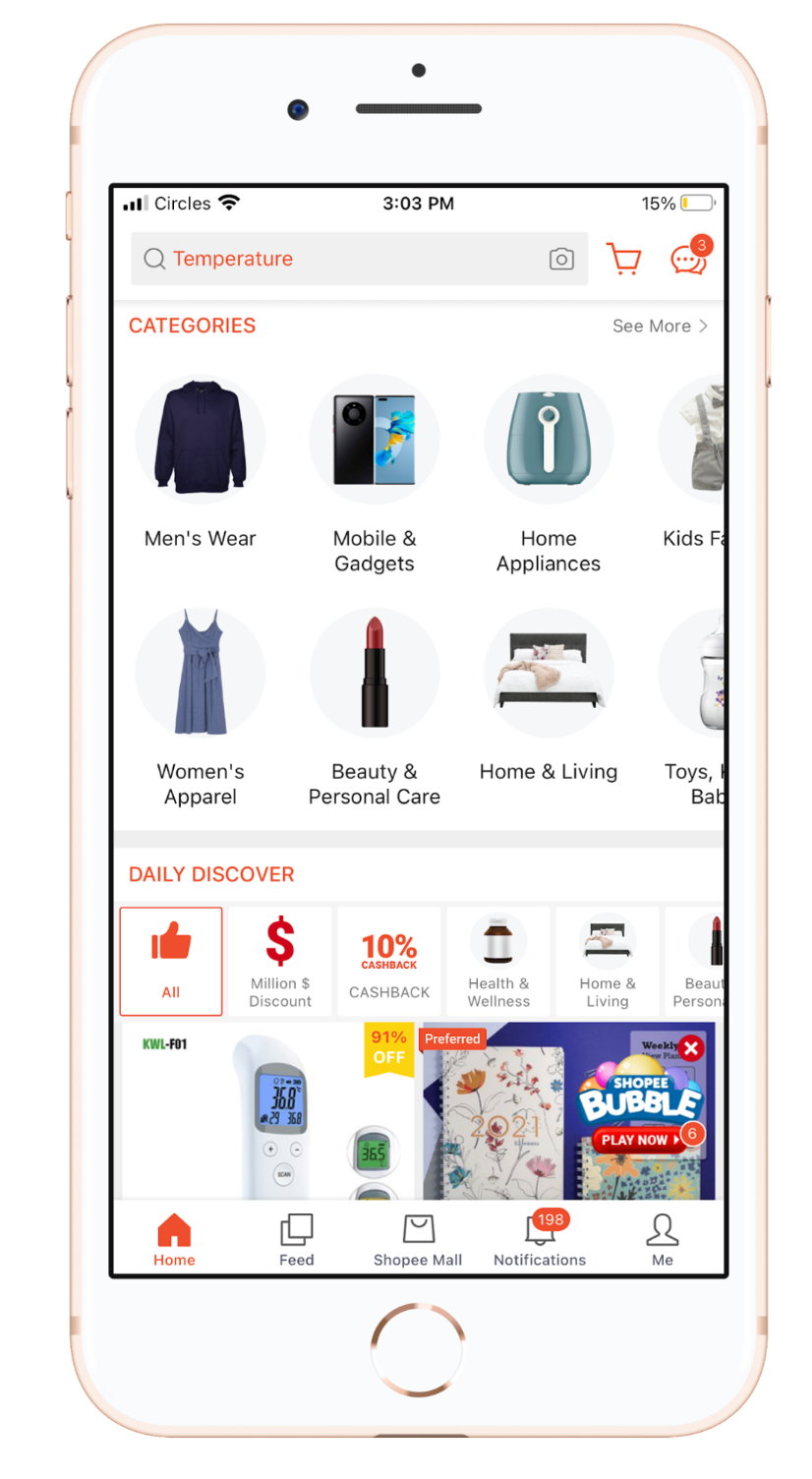
Jakob Nielsen’s 10 Usability Heuristics for User Interface Design was used to evaluate whether the Shopee mobile site is user friendly. One of the major issues with the Shopee mobile app is the cluttering of unnecessary elements. This distracts users from the information they need. The content and visual design of UI was not focused on the essential features of the app. The following slide deck depicts the entire process of evaluating the Shopee mobile app.
User Research
User research was conducted to find out how Shopee works in the real world, with real people. Through user research, we can uncover or validate the user needs and this forms the basis of what product designers should be focusing on. As there are many forms of user research, I decided to go with user interviews, affinity mapping with app reviews, usability testing, user personas, and user journey mapping.
User Interview
I conducted face-to-face interviews with 5 participants to find out how they feel about the Shopee app. Through this, I got to understand my participants’ concerns, worries, and pain points when they were using the Shopee app. The following highlights some of the findings:
- 4/5 participants are frequent users of Shopee. They turn to Shopee whenever they have something in mind or when they want to buy something. One of the users mentioned that Shopee is the first eCommerce platform she thought of whenever she wants to buy something online.
- Only 1/5 participant uses Shopee when he is comparing prices between different eCommerce platforms.
- 4/5 participants use other eCommerce platforms such as Lazada, Qoo10, Taobao, and Carousell. However, most of them prefer Shopee over other eCommerce sites because Shopee is more user-friendly and convenient.
- 2/5 participants pointed out that the user interface of Shopee is cluttered. They mentioned that promotions and vouchers are all over the place and sometimes it is difficult to redeem the correct vouchers to use. Additionally, a large amount of information in the app makes it difficult for the users to use the Shopee app.
- 3/5 participants pointed out that the user interface of Shopee is clean and clear, the site looks vibrant and it is easy to toggle around.
- One of the participants mentioned there were way too many notifications. The user is only interested in important notifications such as order tracking status and whether or not the items in her cart are on promotion. She is not exactly interested in receiving Shopee live notifications.
- When asked whether there’s anything they wish could be improved on Shopee, one of them mentioned that product details on Shopee are not very detailed. Product descriptions must be clear, pictures of the items must be true and reviews must be accurate. Another mentioned that Shopee should filter the reviews before uploading them onto the page to ease viewing. Some of the currently available reviews are not relevant to the product itself. Having a search button in the review section might be able to solve the issue as users would be able to filter/search through the reviews.
- All of the participants mentioned that they do not use Shopee Feed and they do not watch Shopee stories.
- All of the participants read reviews before purchasing products from Shopee. They read the reviews to find out whether items are valued for money, to determine the credibility of the seller, for sizing reference and whether the quality of the product is up to standard.
- However, when asked whether they leave reviews after purchasing products from Shopee, 3/5 of the users do not leave reviews because they are too lazy and the process is too troublesome. 2/5 of the users leave reviews for users and the incentives (Shopee coins).
- 4/5 participants are aware of Shopee coins and they enjoy collecting Shopee coins to obtain more discount on the products they purchase from Shopee.
Affinity Mapping
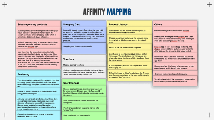
Based on the Shopee app reviews on Apple App Store, I came up with an affinity map to better analyze the research findings and ideas. Affinity mapping serves as a good practice to consolidate all of the relevant usability issues and design challenges. Below is the affinity map which I have generated:
Usability Testing
The Shopee app was evaluated by testing it with 5 frequent users of Shopee. During the usability test, participants were asked to purchase iPhone 12 Pro Max phone cover on the Shopee app. They were tasked to describe what they were doing throughout the entire process of purchase. Users’ engagement with the Shopee app was noted as well:
- 4/5 participants searched for iPhone 12 Pro Max phone cover in the search bar of the Shopee homepage. Within the list of products, there were additional filters. 2 of them clicked on the “Cases & Covers” filter to further narrow down the search.One of them purchased from a store selling silicon phone cover. Another one looked for the phone cover from the “Top Sales” tab and eventually decided to get a $3.80 phone cover with the highest sales. The other 2 purchased the phone covers from one of the product listings on the search page.
- 1/5 participants went to the Shopee Mall tab, clicked on the “Mobile and Gadgets” category, and browsed through the product listings to find the phone cover. A participant mentioned that it was difficult to find the phone cover because all of the products were not classified based on their categories and there was no filter provided to streamline the search.
- All of them looked at the product description and the product ratings and reviews before purchasing the items.
- All of them avoided purchasing items from stores with no review or no item sold.
- 2/5 participants avoided purchasing phone cover that ships from Mainland China. They claimed that the shipping would take very long.
- None of them knew that they can browse and search for products in the Shopee Feed. In fact, none of them used the Shopee Feed before.
- In general, most of them were able to purchase the phone cover.
User Personas and Journey Mapping

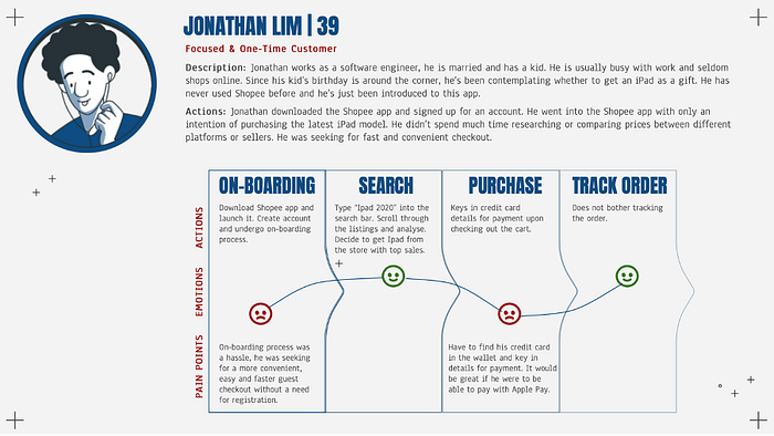

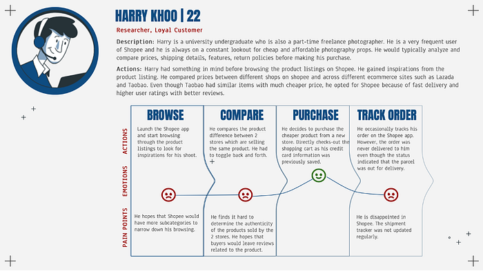
Prototype
Homepage — Less is More!


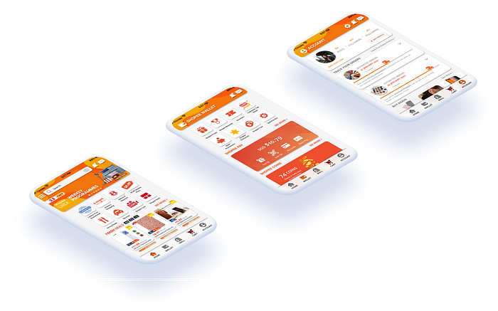
In an attempt to declutter the homepage of the Shopee app, I removed the advertisement banners and only included the relevant sections such as flash deals, trending products, and featured collections. This was done so to improve the shopping experience by minimizing distraction from the excessive number of elements on the page.
Flash deals now contain product names, product photos, price of the discount products, and better features to entice users to grab items from the section. Instead of trending searches, I figured out that users might be more interested in finding out the trending products which other consumers are purchasing. Therefore, I switched out the category.
Shopee Stories have also been shifted to the Chat page to reduce unnecessary cluttering on the homepage.
Categories — Easier Access!
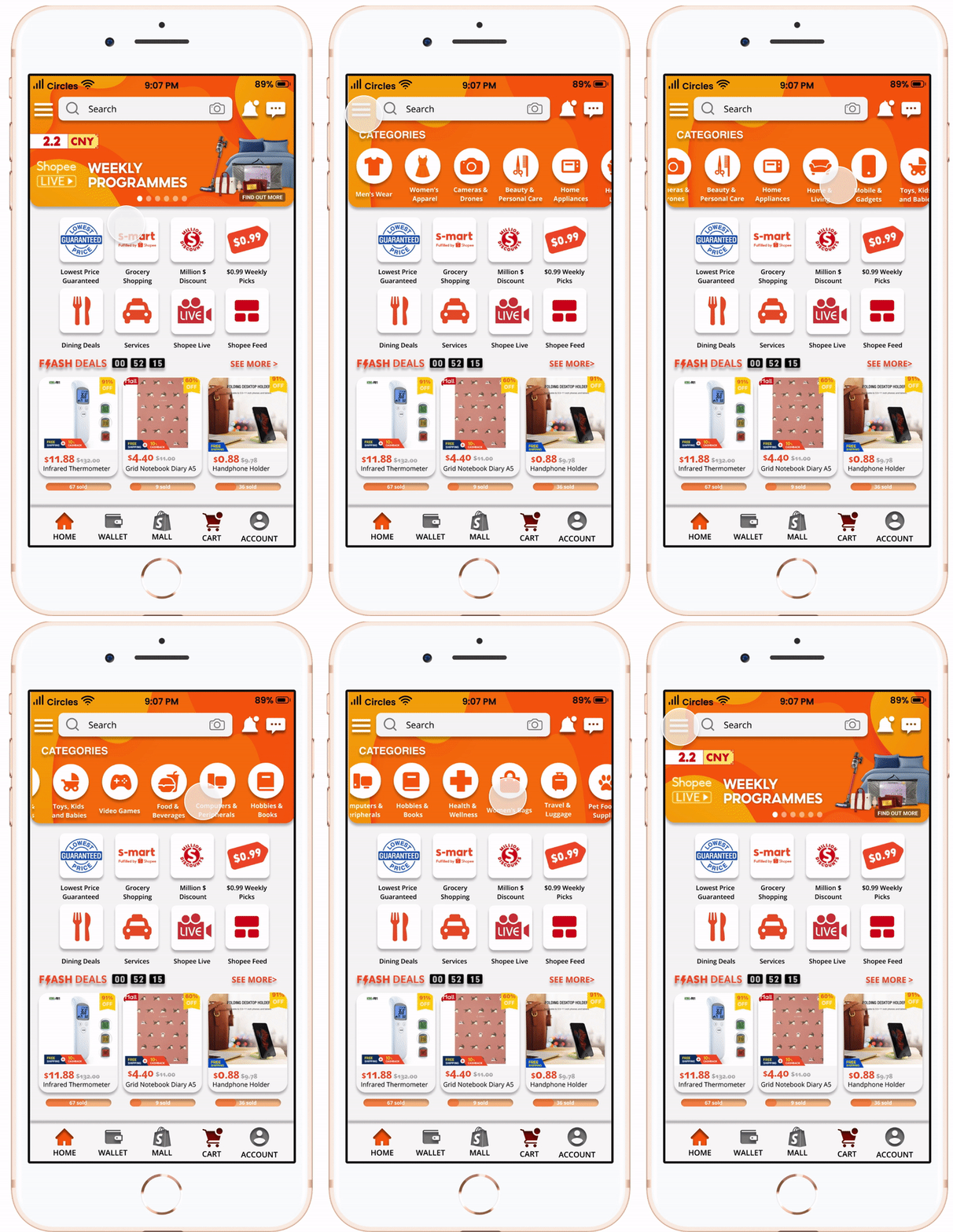
Categories of products can now be easily accessed using the icon on the left of the search bar. Users get to enjoy their shopping experience on the homepage with access to the categories.
Notifications & Chats — View and Reply!

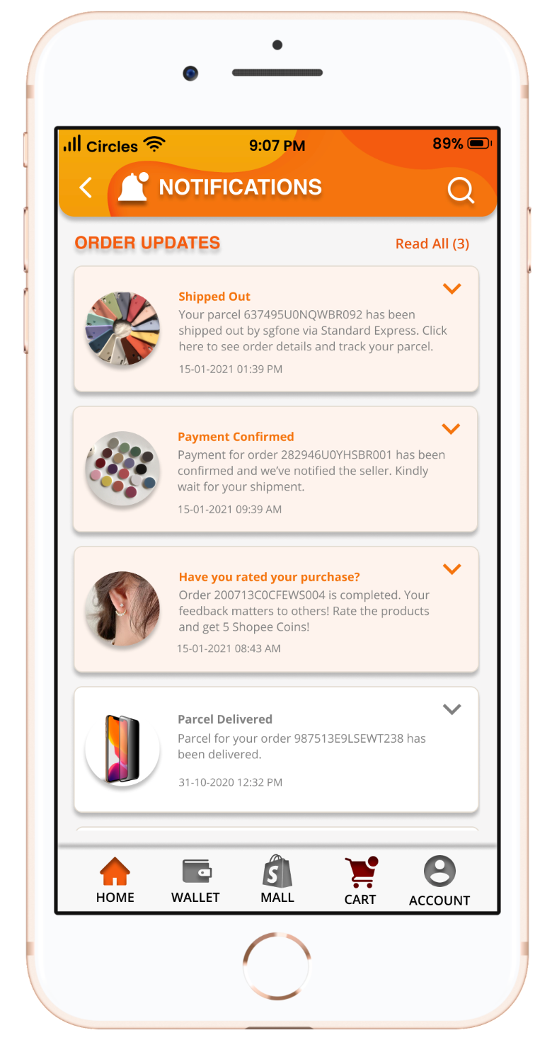

A frequent complaint that I received from the user interview was the excessive number of unwanted notifications from Shopee. To reduce clutter, only order updates would be reflected in the notifications tab. Wallet updates and Shopee/Account updates were shifted to the wallet tab and the account tab, respectively. This allows users to focus on the important order notifications.
Shopee stories from shops now appear on the chat page to reduce clutter on the homepage. Buyers who are interested to know more about different products from a particular store would be able to access the Shopee stories here.
Wallet — Consolidated Features!


To allow easier access to Shopee Vouchers, Shopee Coins, Shopee Rewards, promotions, discount codes, and deals, I switched out the Shopee Feed icon with a wallet icon in the bottom navigation bar. During the user interview, all of the participants commented that they have never used the Shopee Feed before. On the other hand, all of the participants enjoyed using Shopee Coins and Shopee Vouchers for extra discounts on their items. This justifies the need of creating a special tab that consolidates all the relevant virtual currency and cashback vouchers for the users.
Shopee Mall & Product Listing — Same same but different!


Shopping Cart — Make it Stick!
The shopping cart icon and the notification icon switched places. Previously, the shopping cart icon was placed right beside the search bar. Users might easily neglect and abandon their cart without checking out. To make it easier for users to explore and toggle between the shopping cart page and the other pages, the shopping cart icon was shifted to the bottom navigation bar.
To reduce cart abandonment, the color of the cart changes from grey to red when items are added. This subtly nudges customers to check out their cart.
Account — A New Look!
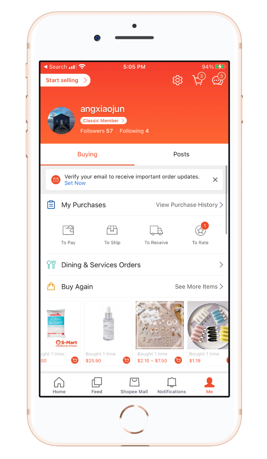

Users can now track their orders item-by-item on the account page and they can view their order history. They can access their store by tapping on posts!
Try it yourself!
Scale down to fit the display for better user experience.
